May, 2014 - University Final Major
The Situation

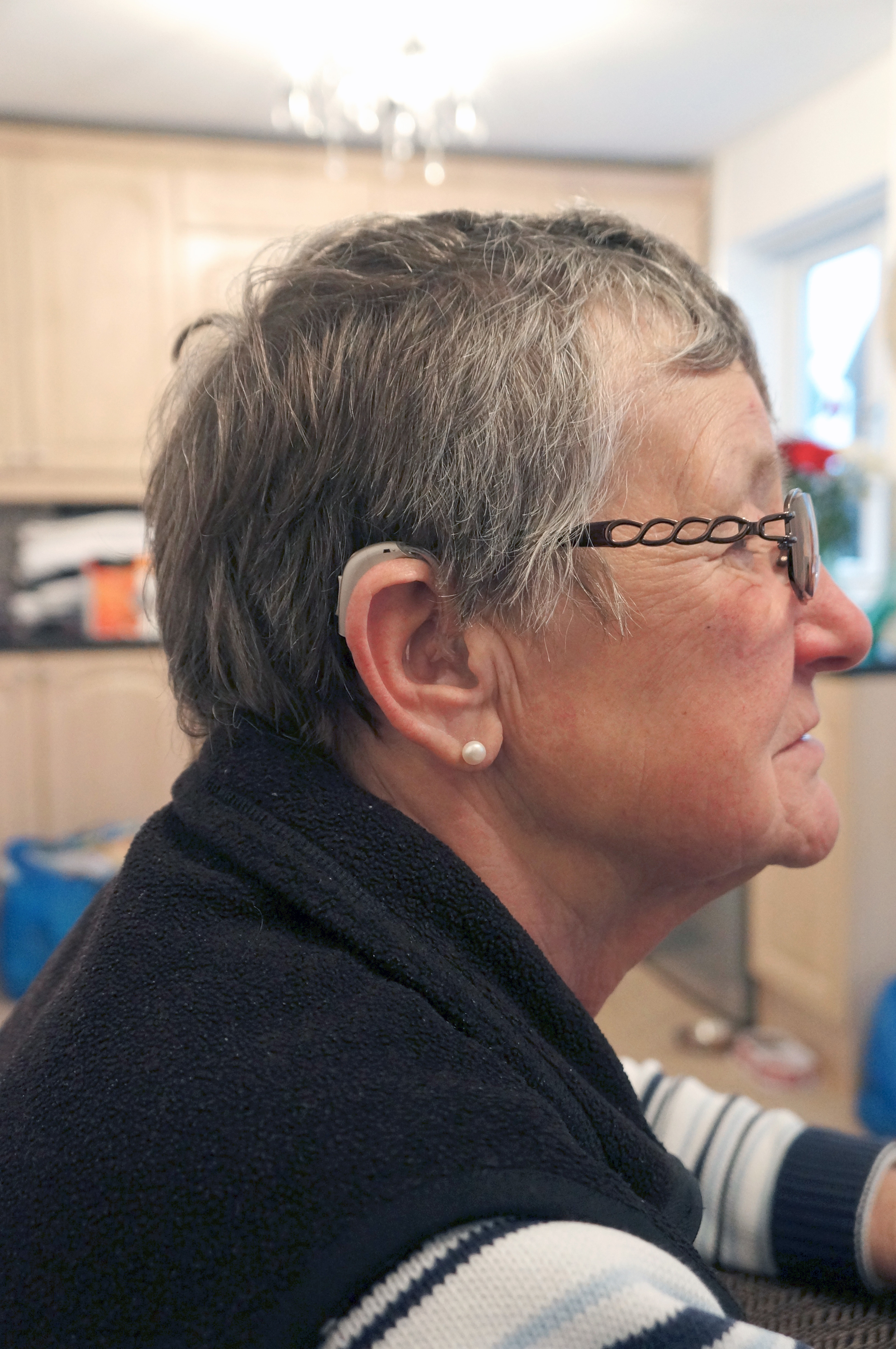
Hearing aids aren't pretty. Those who could benefit from them are often put-off through the elderly stereotypes, negative “beige-box” designs and avenues available to acquire the device. Hearing loss is a natural part of ageing which increasingly affects 40% of over 40’s in the UK alone.
Spectacles were once seen with a similar negative stereotype, but have transformed into a stylish, fashionable accessory. I looked to follow in the footsteps of spectacles and redefine the stereotype of a "hearing aid" into a beautiful, personal accessory.
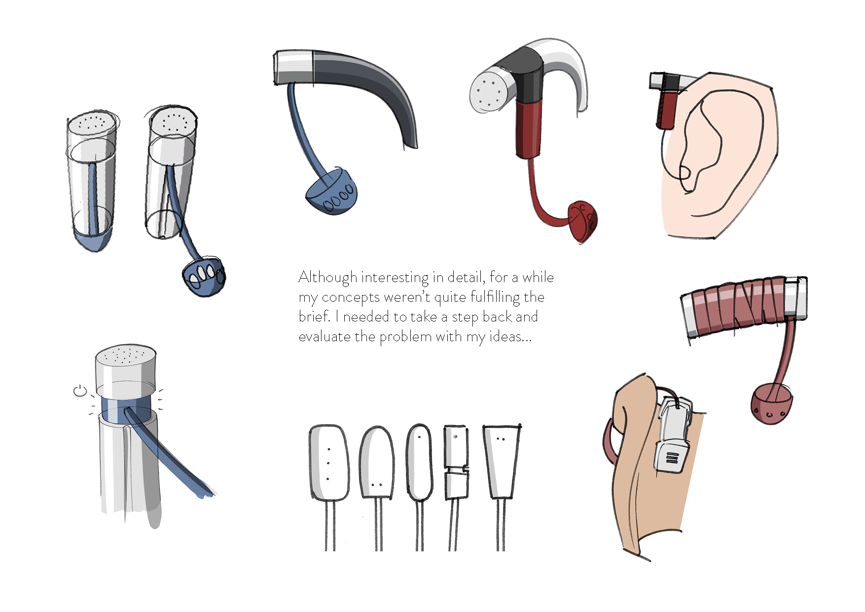
Digging for Insights

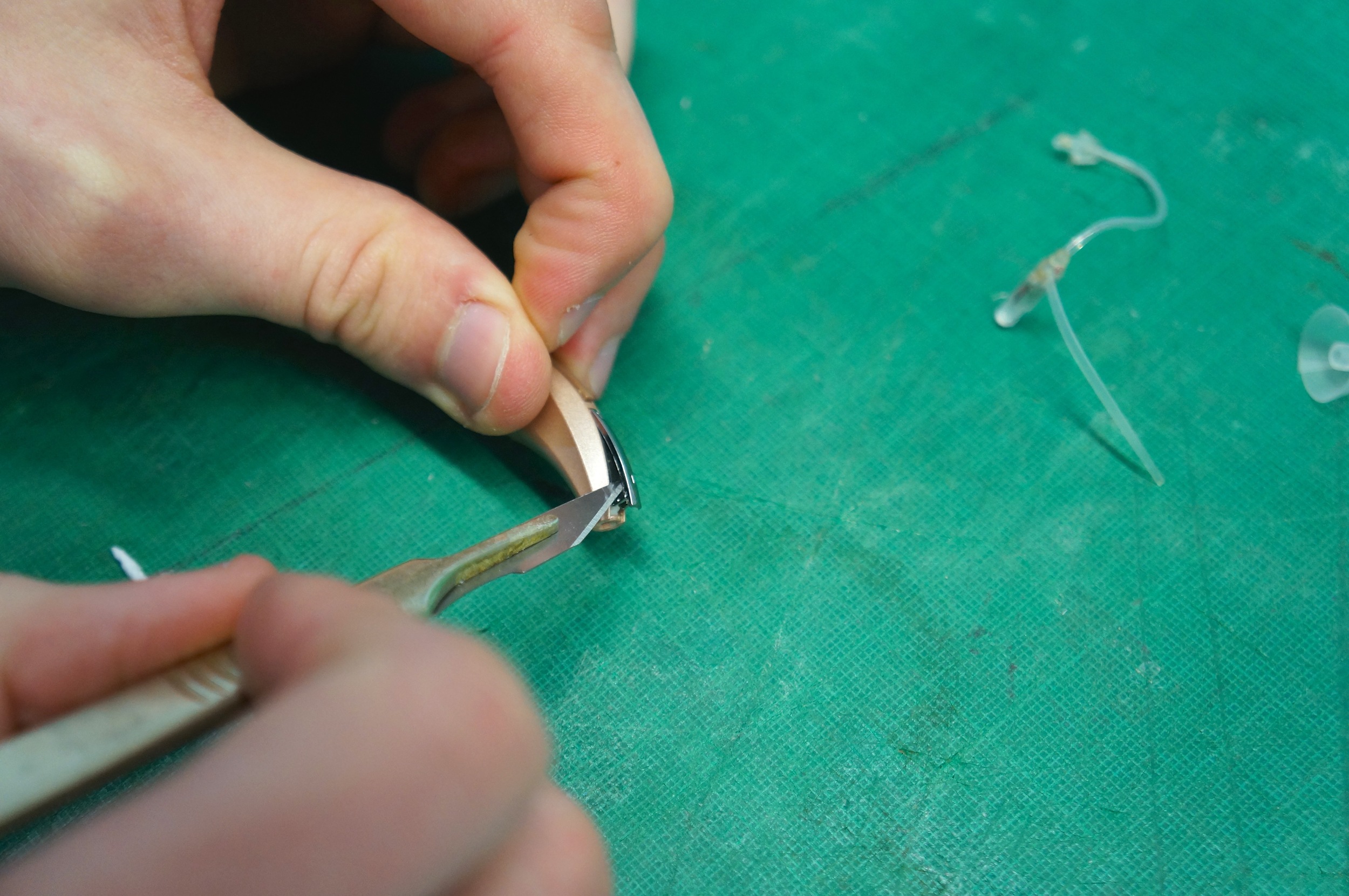

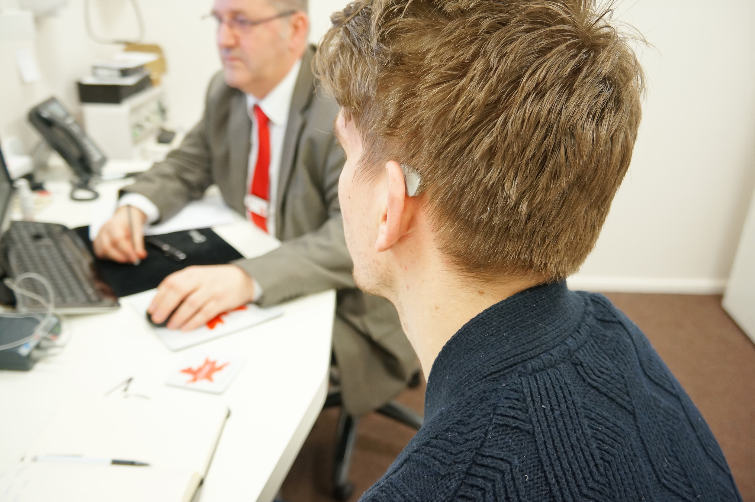
I investigated the products inside and out, by evaluating the entire product market, experiencing the process of a hearing test, purchasing and living with a device and dismantling a physical aid. Utilising a network I'd built of every stakeholder involved in the process, from existing users and those who should be using them, to audiologists, retailers and hearing aid designers I could learn the boundaries and begin to challenge any preconceptions.
The physical product

The experience
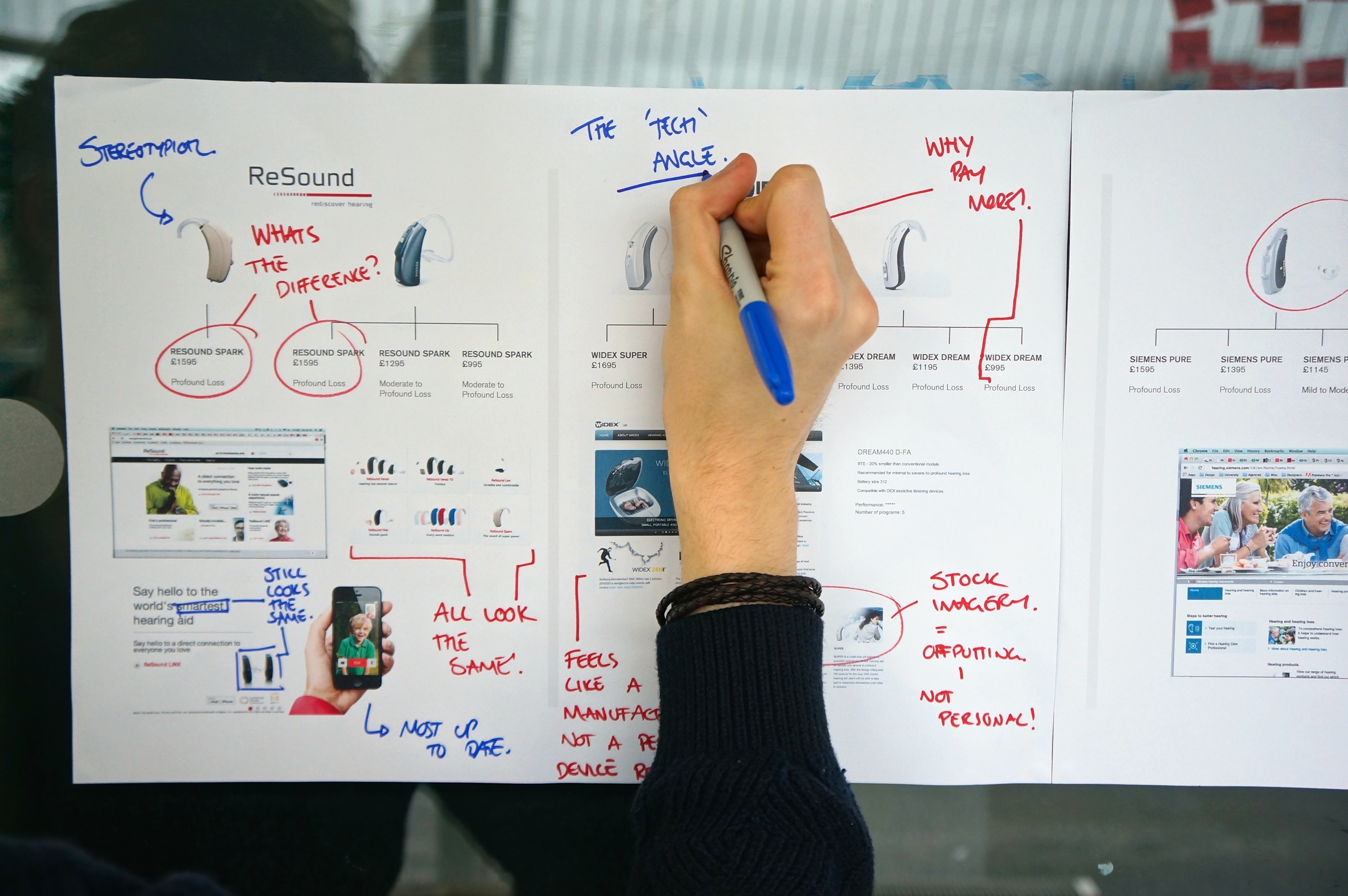
Most people aren’t aware they have a choice. They either go through the NHS and receive a stereotypical beige box or go private and pay expensive prices for slightly more colourful feature heavy devices. Although perceivably better in functionality, they are still surrounded by the same stereotypical stigma.
Most users discussed being comfortable with their aid, yet their actions spoke differently. Hiding behind hair, covering it up as we discussed in public, choosing a small "discreet" aid in a flesh or matching hair colour to blend into the skin. A trait which manufacturers often promote as a positive, and so the stereotype of 'hidden is better' continues.
The Opportunity
To me, there was a clear need for a device which doesn't hide but celebrates its existence with confidence. An object which provides a sense of value, something the user can be proud of.
The buying experience and brand had to be considered on a similar level. It was important that the new design was no longer seen as a medical aid, but instead as a personal accessory.


The New Stereotype
As the industry continues to compete for the most discreet device, Listen Carefully flips this convention on its head by celebrating its existence. A principle that has been considered at every touchpoint of the design – from branding to the product experience.
This is no longer a hearing aid, its Hearwear.


The combination of a striking new profile and the personal element of moulding the device to your ear helps differentiate it from the current stereotype of a hearing aid, whilst providing a sense of ownership.
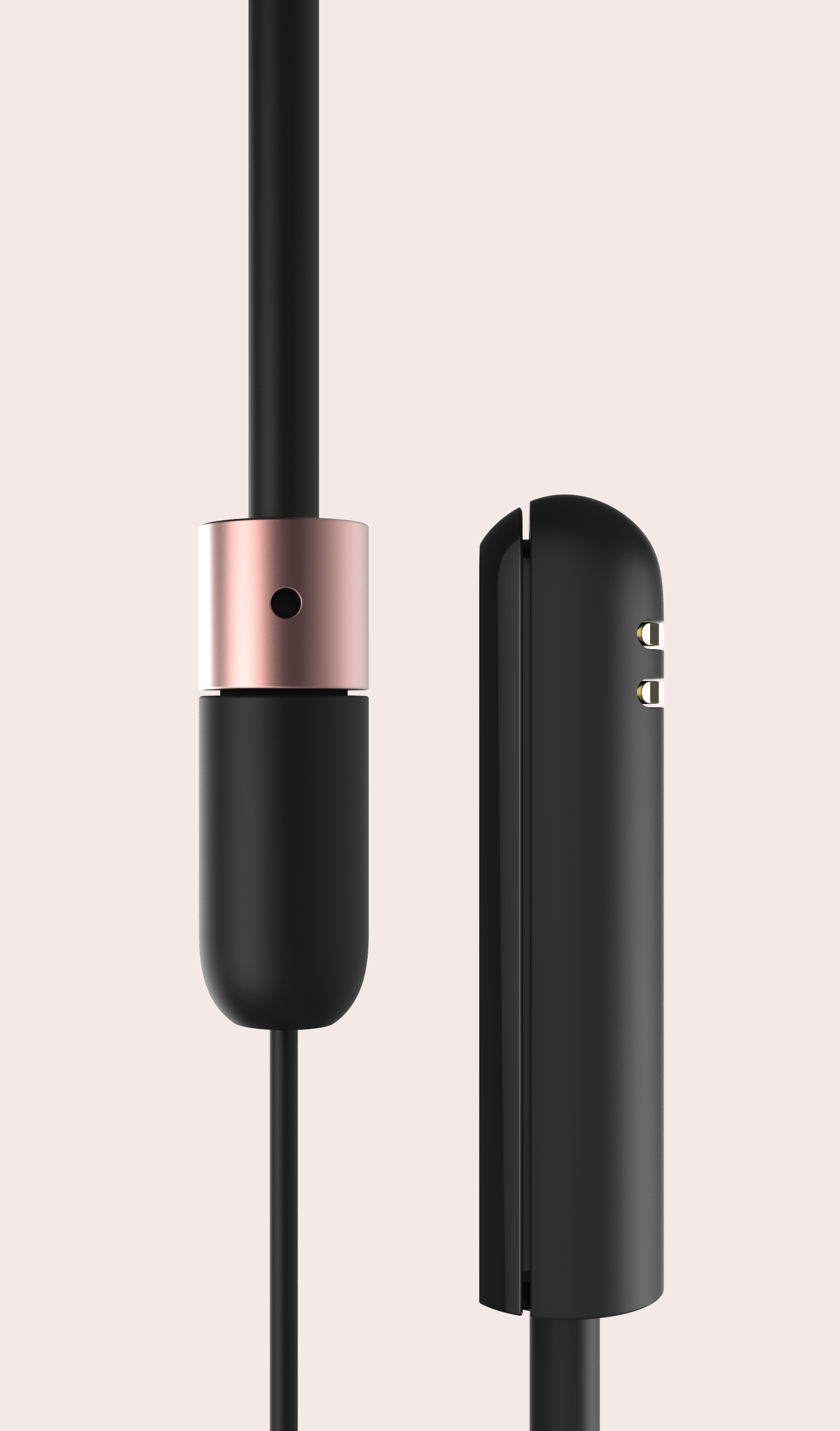
The modular nature of Hearwear provides the opportunity to combine material finishes to suit the users personal taste. The introduction of premium machined metals (Gold, Rose Gold, Silver) give the object a jewellery like finish and value - inspired by valuable personal items such as a fine pen or high quality watch.


Unused channels and features have been reduced to simple gesture based interactions, a simple on/off click and touch sensitive volume control. Designed to be intuitive and easily achievable whilst wearing the device. The introduction of contact charging through two gold strips provides a considered alternative to the unpredictable and fiddly replaceable batteries.

Retail and Brand
Unlike the medical routes before it, Listen Carefully would be positioned alongside fashion and tech alike, in large department stores such as Selfridges, John Lewis and Bloomingdales. Once established, LC could expand into its own retail stores. Additional marketing within popular fashion magazines such as GQ and Vogue would help provide the aspirational outlook hearing aids need.
The logo has been treated with a similar attitude, aiming to feel familiar to its fellow fashion and tech brands, whilst standing unique in its position as a hearing implement. Brandon Grotesque was chosen as the main typeface because of its timeless geometric proportions and rounded welcoming personality, details the logo reflects.


Every single touchpoint has been designed to not only add value, but to step away from the negative hearing aid stereotype. Listen Carefully accepts impaired hearing as a common part of life and provides those in need with an alternative premium and accessible experience.